Hand Lettering: Rae Dunn-Inspired Alphabet

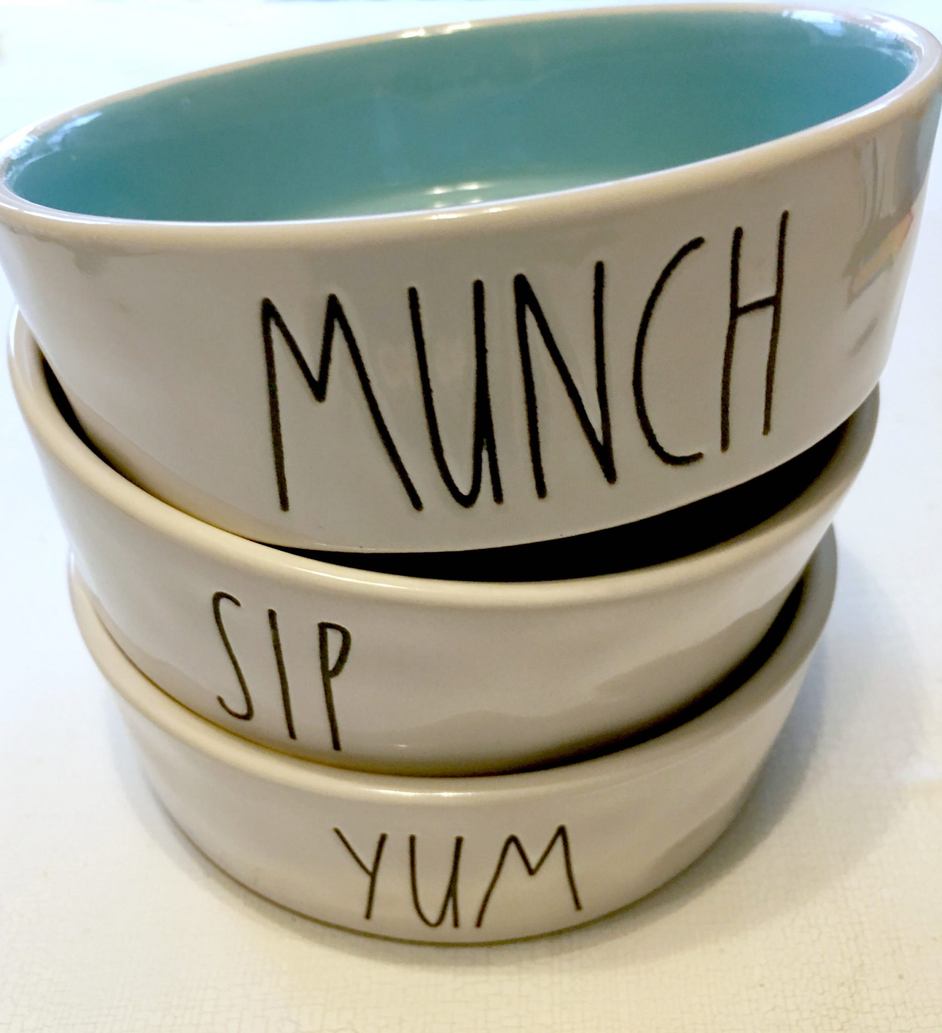
I know I’m not the only one who absolutely loves the look and style of Rae Dunn pottery. I’ve admired many of the mugs and other pieces for a while now, and I own a pencil holder that says “Write.” Just last weekend, I picked up these adorable pet food bowls for Flynn while shopping at Home Goods. Seriously, how cute are these?
The lettering on these products is simple and minimalist, like the pottery itself, which is a big part of its appeal. If you love the style like I do, you might want to try incorporating something similar into your own hand-lettered designs. In order to understand how Rae forms her alphabet, we first need to look at the anatomy of a letter.
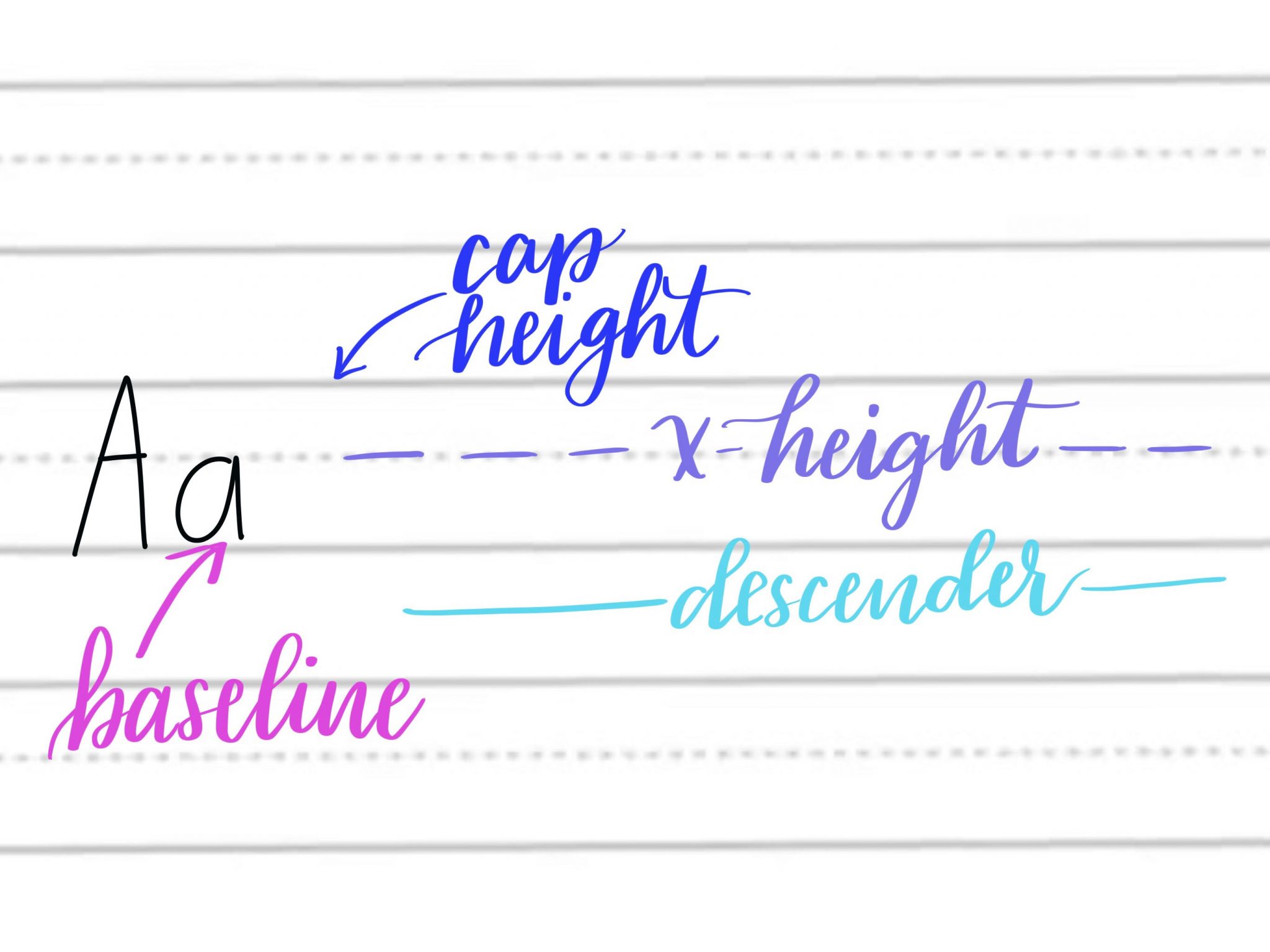
When we write, whether we’re using lined paper or not, there is a set of invisible guidelines we follow. The baseline is where the bottom of each of our letters sits. The cap height marks how high the tops of our capital letters go. The descender line is where the tails of letters like “p” or “j” travel below the baseline. Finally, the x-height marks where lowercase capital letters stop and where we cross letters like “A,” “H,” etc.
We’ve talked before about how sometimes artists learn the “rules” in order to break them on purpose. For example, in the popular Bounce Lettering style, we ignore the straight baseline and allow our letters to travel to different heights within a word.
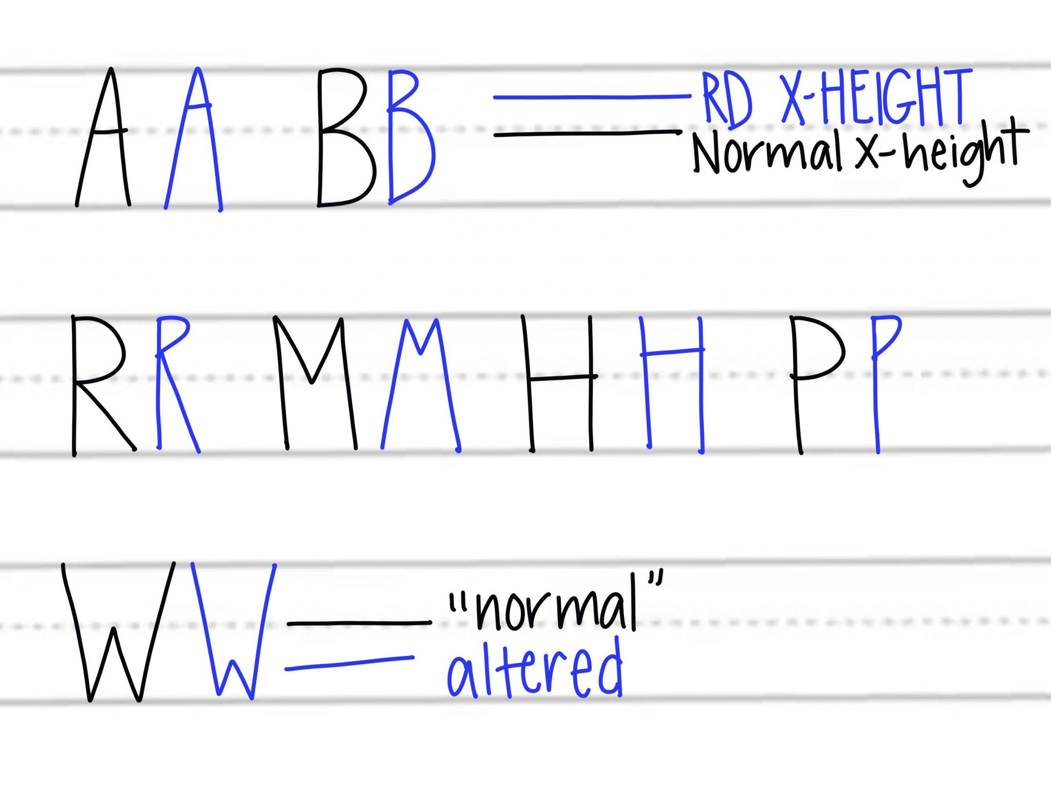
To achieve the iconic Rae Dunn-inspired style, we have to break a different rule…the x-height. Instead of crossing letters like “A,” “E,” “H,” and “F” at a normal x-height, we’re going to push the crossbar up toward the top of the letter. The same thing goes for letters that have lines touching or intersecting at x-height, like “R,” “M,” “P,” and “B.” The one exception to this is the “W,” where we’re going to use a lower than normal x-height instead. Take a look…
Here’s a look at the whole alphabet written in this style.
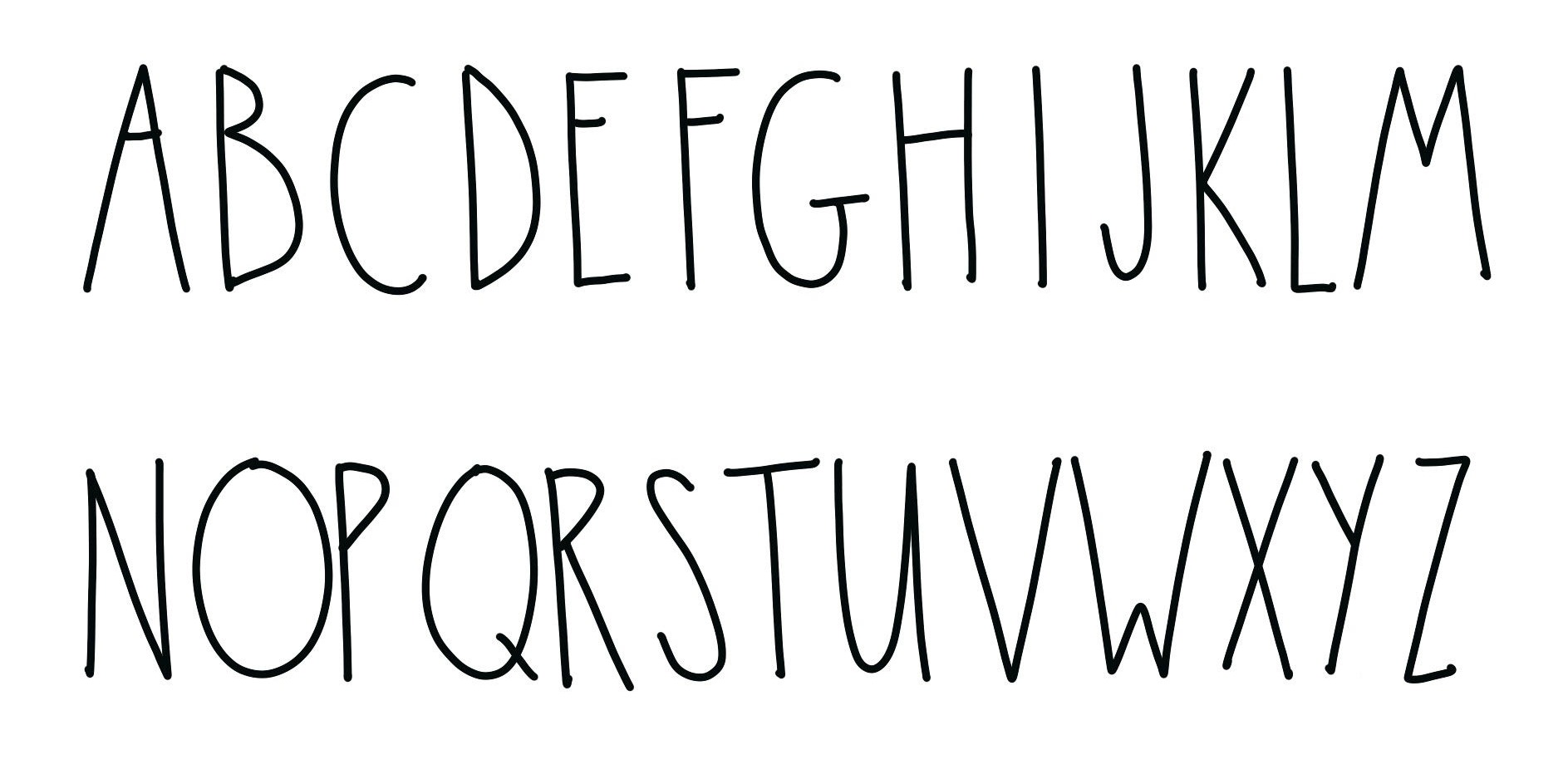
There’s no need for a lowercase alphabet, because as you’ve probably already noticed, Rae Dunn print only uses capital letters. If, however, you wanted to try your hand at a lowercase version, just break the rules in the same way and raise the x-height.
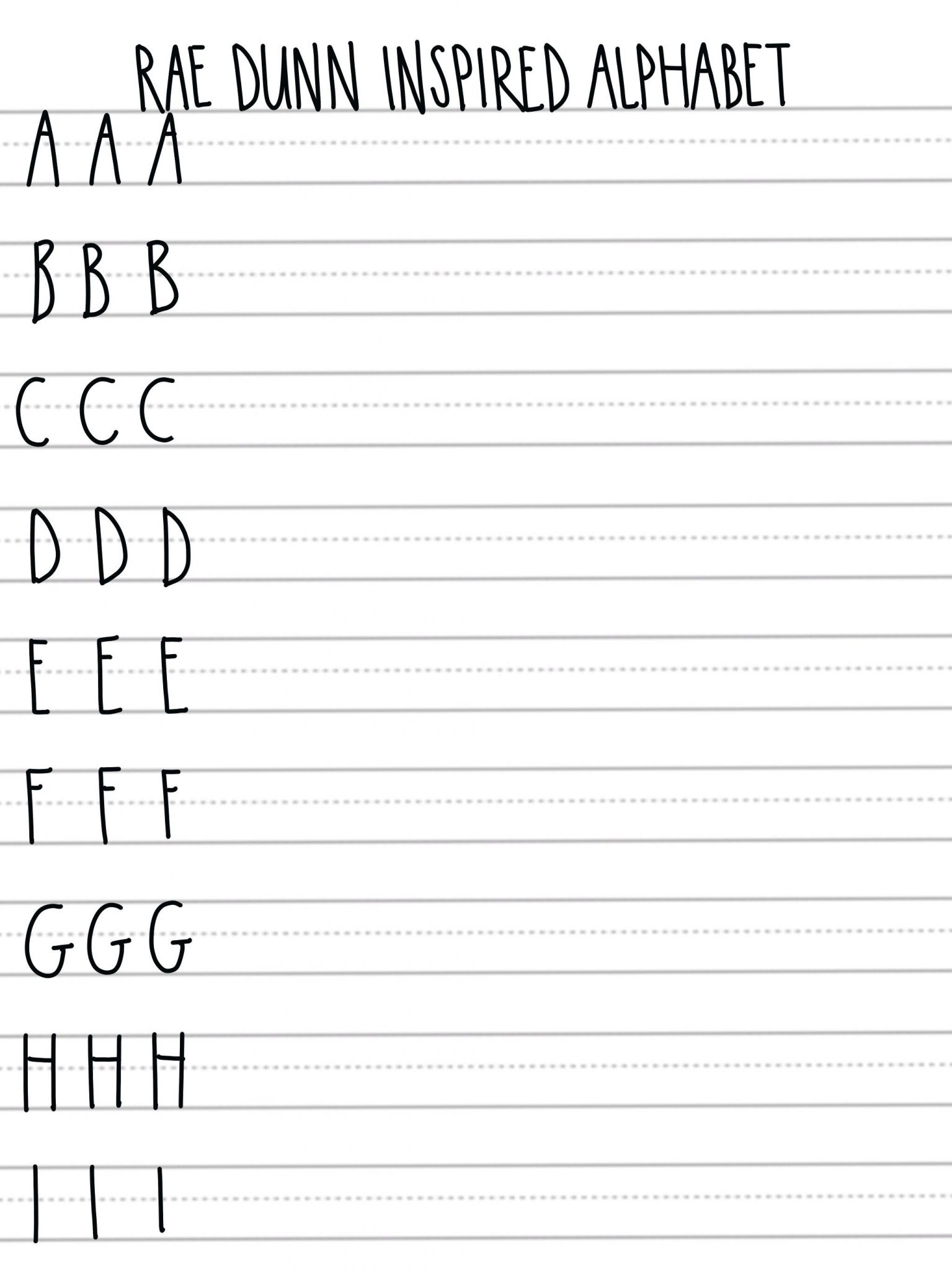
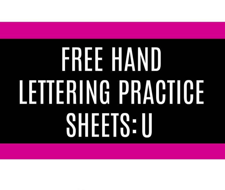
As with any new font or lettering style, practice makes progress, so you’ll want to practice writing this alphabet a few times before incorporating it into a project. I’ve created some free practice pages for you to use; just click the link below and download them to your device. Then, you can either print them out, or you can open them in the Procreate app on the iPad Pro and practice digitally.
Download practice sheets here!
Once you’ve gotten the hang of it, you can have fun mixing this style with some of your other favorites to create your own unique hand lettered designs. Remember, part of the charm of this look is that it isn’t perfect. The lines aren’t totally straight and they are visibly hand-drawn. So, don’t put too much pressure on yourself! I can’t wait to see what you create.


Testing comment before I rewrite the whole thing
What pen/marker did you use for this? Would a Micron be good?
Yes, that would be a perfect pen to use.
My daughter and I are into making crafts along with signs pretty much all farmhouse .I’ve been having a hard time making my letters .
I can write and print pretty decent but when it comes to putting those letters and words on a sign or a craft ,I’m not sure how I should do it
But …watching your videos is really helping .When I use the letters that you’ve made it seems to come out so much better I really want to thank you for all the work you’ve put into this to help people like me to learn .
Thank you so much for your comment! I am so glad you’re having success with your letters now!
Thank you!! This saves me a lot of money
In a Sponge Bob type voice… A few years later….. 🙂
Your tutorial for Rae Dunn inspired lettering just showed up in my feed. I love it!! Thanks so much 🙂
Yay!