Lots of Lines Hand Lettering Font
Friends, I thought it was time to introduce a new font to use in your hand lettering projects! So far, we’ve learned a simple Brush Alphabet, Whimsical Print, and a Valentine Font. Today, I want to show you a fun style I like to call “Lots of Lines.”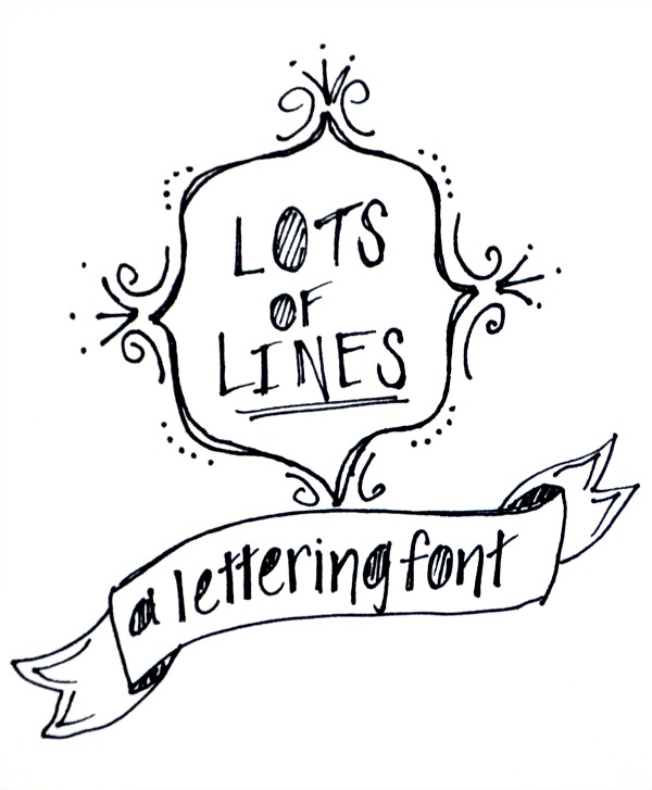
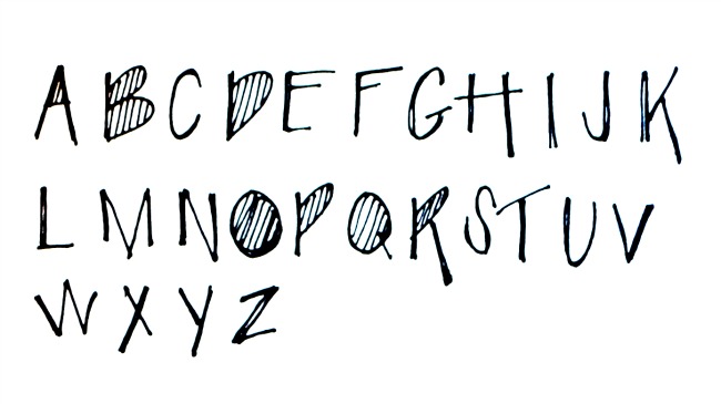
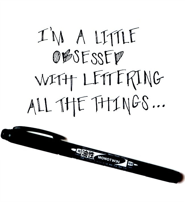
I like to use a very fine tip pen or marker for this one; my personal favorite is the Tombow Monotwin. The basic idea is that any letter with a rounded or enclosed space gets filled in with lines. Also, you’ll notice that certain parts of letters are longer or shorter than others, as you’ll see in the “H,” “K,” “M,” etc. Here is the uppercase alphabet:
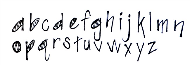
When I write in this style, I tend to do so in all caps, but you can certainly mix in some lowercase letters as well. Here is a sample lowercase alphabet:
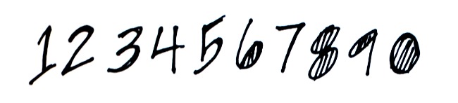
And, since certain projects require numerals, here’s a guide for those:
Feel free to save and print any of the samples for your personal use as you practice and master this lettering style! Here are a few examples of how the letters look when you combine them to make words:
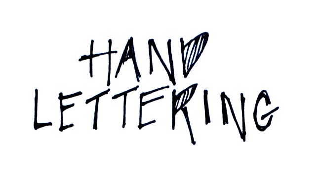
It’s a fun, casual font that adds a playful touch to your project. It pairs nicely with the brush alphabet too. Well, friends, I hope you enjoy adding this to your lettering repertoire. I don’t know about you, but…
For more hand lettering inspiration, head here to see the rest of the posts in this series. And, be sure to check out my e-book, A Hand Lettered New Year!


I’ve always wanted to do hand lettering. I just don’t know how.