
What We Wore: Color Blocking and Family Photos
Since we’ve been talking about photo Christmas cards, I couldn’t help but think of the universal family photo dilemma.

I have a love/hate relationship with family photos. I love, love, LOVE when I get a good one. I hate the stress of trying to make sure everyone {especially me} looks good and the worst part of all is figuring out what we should wear. This year, I was really excited about the outfits I came up with for all three of us…but first, let’s take a little trip down memory lane.
2008: The Matchy-Matchy
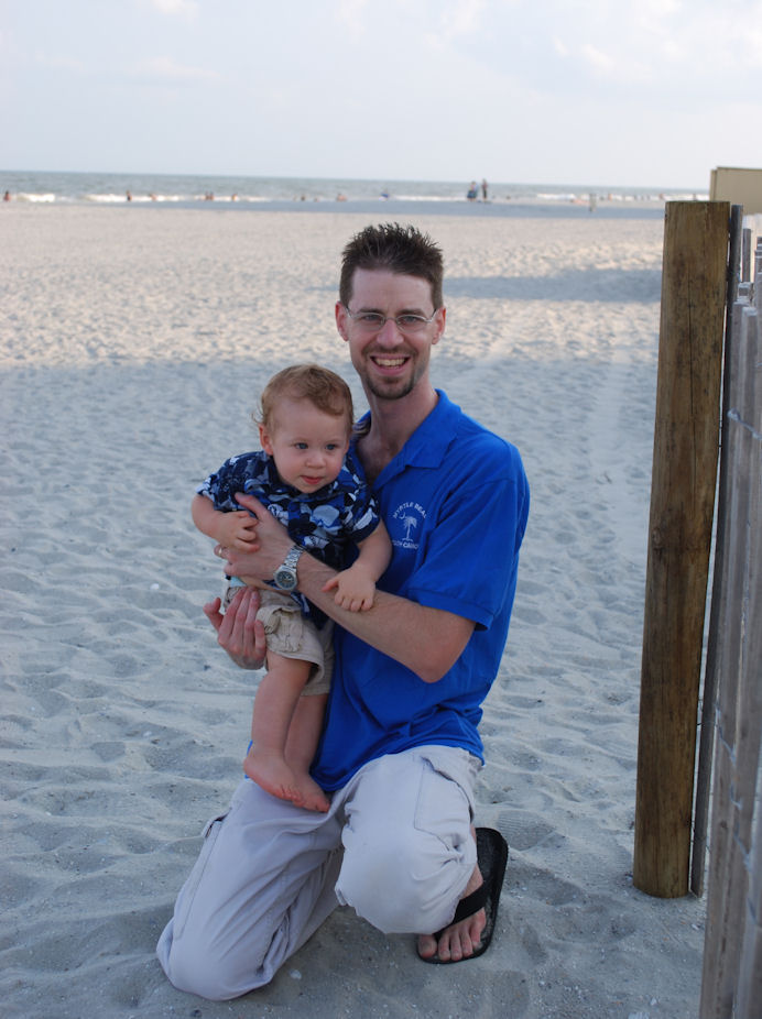
Look! We’re triplets! Except that one of us is extraordinarily tall and one of us can’t eat solid food… I had no idea what we should wear for our first official family beach photo, so we went with the old everyone-wears-a-white-shirt-and-jeans option. Meh. I was never a huge fan of the outfits {or of that extra baby-weight}.

2009: Coordination Citation
This time, I decided we needed color! I thought royal blue would look nice with the ocean, so I packed a blue sundress and LC’s Hawaiian shirt. I then forced hubby to buy a matching polo at the Myrtle Beach Target. We didn’t manage to get an entire family pic that year, apparently.

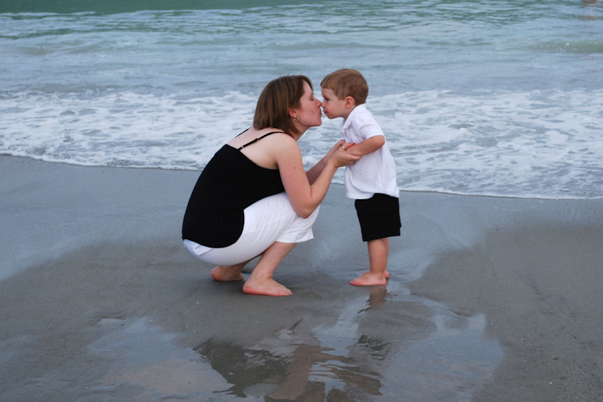
2010: Opposites Attract
I knew I didn’t want the all white and denim look again, so we tried a new option; black and white. To mix it up a little, I had the boys do white shirts and black pants, while I did the opposite. Why is it that the random stranger we ask to take our beach photo is the one who has never seen a DSLR camera in his or her life? And who is apparently unwilling to get out of the comfy beach chair to take the picture…Um, hello, don’t mind us, we’re just floating in the clouds…

We did get this pic, though, which is one of my all time faves…
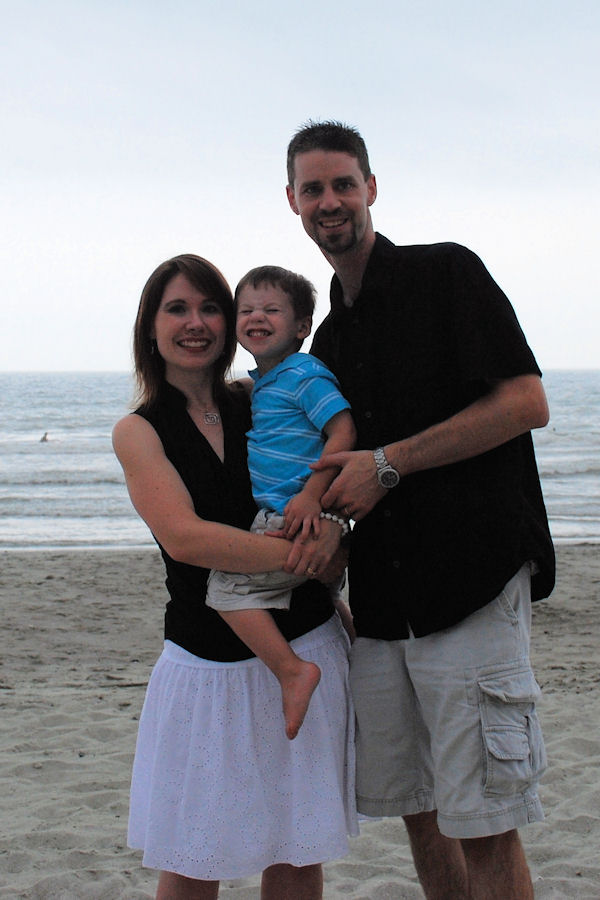
2011: Random Pop of Color
The motto for this one is “I forgot to plan our outfits so let’s see what we can scrounge up out of our suitcases.” Hubs and I both had black tops, LC didn’t. So, he was turqouise. It looked great in his solo pictures, but our family pic was just kind of awkward. Icky lighting too…sigh.
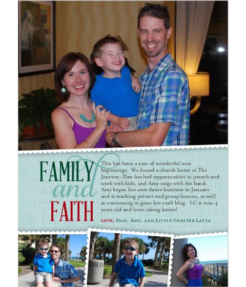
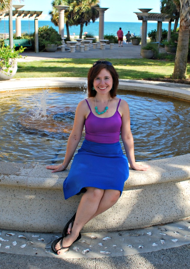
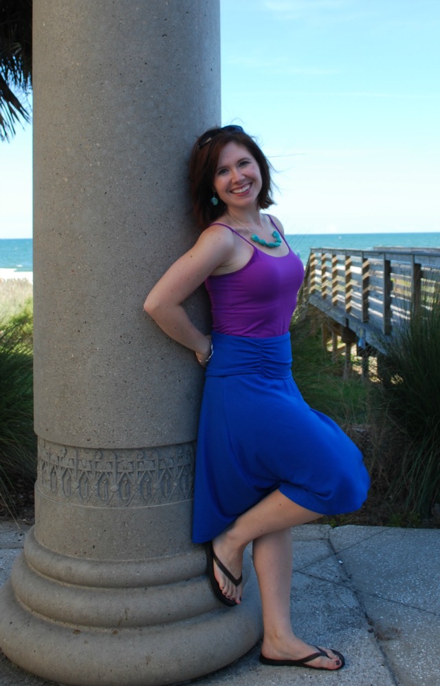
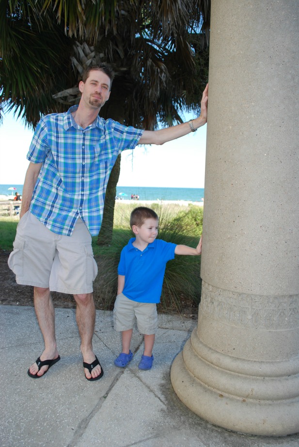
2012: Color Blocking SUCCESS!
This year, I think I finally got a winning combination! I built everything around my own outfit and the idea of color blocking. I went with jewel tones; a royal blue skirt from Old Navy, a magenta top from NY&Co, and turquoise jewelry I made myself.
As for the boys…LC had a turquoise polo and khaki shorts, and the hubs had a great plaid shirt from Target that incorporated both the turquoise and the royal blue. Which meant…we looked great together! We coordinated without being too matchy-matchy, and there were enough colors to keep things interesting to the eye.
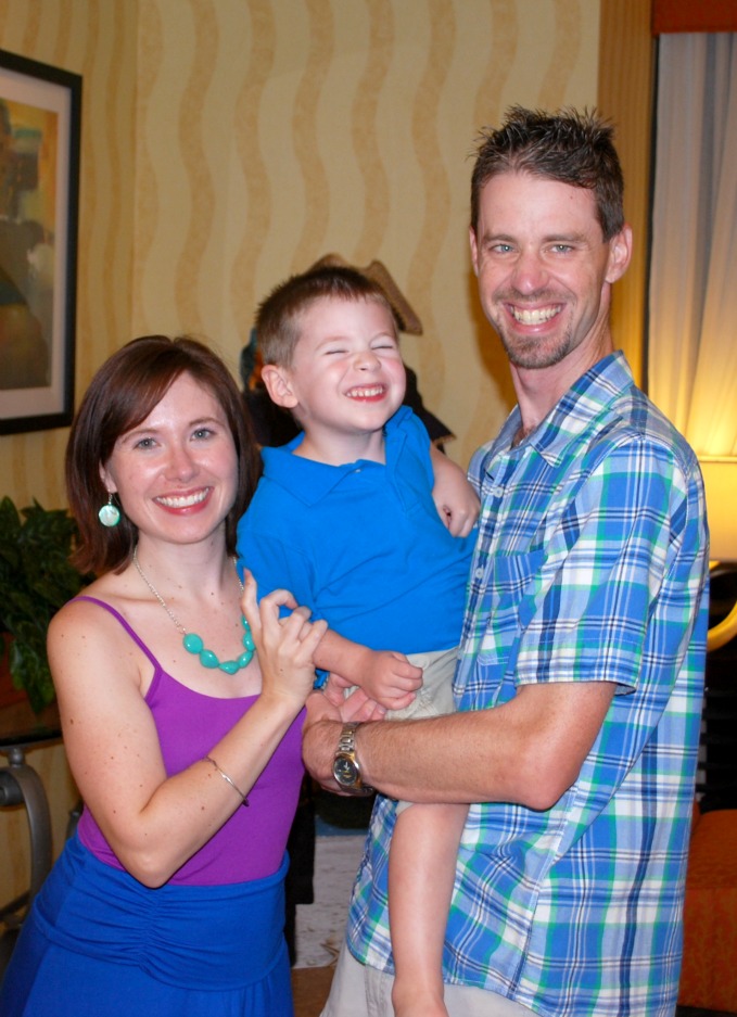
LC and I coordinated on our own, and he also coordinated with his Daddy.

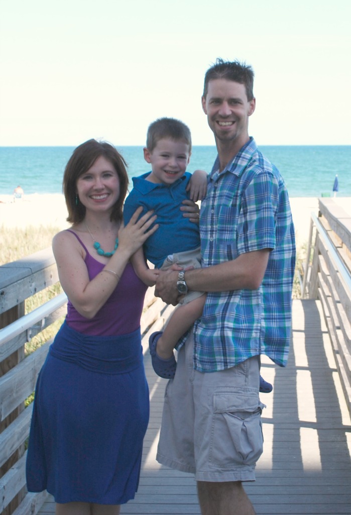
Our entire family beach photo was {once again} a fail…bad lighting, bad exposure. Sigh. One day we’ll get it right. For now, our best family photo is the one taken in the hotel lobby. Such is life.
This is by far my favorite outfit combination we’ve come up with. I also found that I can easily adapt my own outfit for fall by adding a cute little magenta cardigan and a turqouise belt, along with some tights and boots. What’s your favorite way to plan family photo outfits?
And, don’t miss out on the $50 Shutterfly giveaway so you can order your own holiday cards!


You all look adorable!
I like color in our photos too! And not to bee too matchy! I have assigned a color to each family member for most professional pics. Hubby in blue, DD1 in pink, DD2 in yellow, and purple for myself. The girls wear similar dresses or tops in their color. Parents in comfortable shirts and easy bottoms. Keeping my family casual makes it less stressful for them. This makes the photos more natural.
The 1920’s theme photo shoot was a blast. My husband was thrilled that he didn’t have to smile, and my daughter loved the dress she got to wear. That was a hit.
I dread choosing clothes for family photos. Back in the days when we just had two little girls, we could find matching or coordinating outfits for them and go with a similar color for hubby and me. But, as they grew and we added more kids the difficulty in coordinating everyone grows exponentially. I probably look like a crazy lady wandering from the boys section to the mens, then back to boys, then to toddlers, then to girls, back to boys, to girls, etc. I’ve learned that trying to match colors across sizes doesn’t always work. I may just go black and white or sepia in the future and avoid any color discrepancies. I think my all-time favorite family photo is a sepia-tone one where where all in pioneer-era costumes. It’s a great memory of a fun trip.
Thanks so much for linking up at the Ginger Jamboree! I hope to see you there next week!
Great pictures. We always try to “match” by some theam. The ladies will wear stuff kind of the same, and the guys will wear stuff kind of the same.
very cool post..thanks for the tips….you have a beautiful family…xo
Looks like you have some beautiful pictures to choose from! And I totally know what you mean about stressing about trying to find the perfect one.
I agree, that last one is great! For our anniversary pics this year we both wore dark jeans, and because it was cold I had my “pop” of color with a bright purple jacket and my hubs had a colored scarf on. I think it worked out well and I think you’re totally right that adding a bit of color makes for better pics. 🙂 Thanks for sharing at The Fun In Functional!