Getting Started: Blog Design
Looking for the Shine on Fridays party? Click here!
The first topic in the Growing Your Blog Series is Blog Design.

When someone visits your blog, the first thing they notice is your design. Before they read a word of any of your fabulous posts, they get a first impression based on the overall look of your little corner of the blogosphere. Your background, your header, your text, and the overall appearance of your blog make a statement about you and readers will make a snap judgment, for better or worse. Here are a few questions to ask yourself as you critique your current design.
1. Is it original?
When readers come to One Artsy Mama, I want them to know they’re here and not one one of the other thousands of blogs out there. There are a lot of things that get really popular in the blogopshere and then all of a sudden, everyone has a new blog design and they’re all the same colors and themes. Are they attractive looking? Absolutely. But can you immediately tell what blog you’re visiting? Not always. I wanted to create a sort of “brand” idea here at OAM so that when you come here, you know where you are. And when you see me on Facebook, Twitter, and Etsy, you recognize me there too. Each place, you’ll see the pink/green/orange/yellow combo and that familiar flower.
Coming up with a color scheme and some kind of identifiable logo or graphic that sets your blog apart goes a long way.
So, ask yourself what it is that makes your blog look special and unique.
2. Is it “you?”
Most of us do this whole bloggin’ thing at least partly for self-expression, so we have to make sure our design does just that. Your “look” should say something about who you are or what your blog is about. Mine is bright and fun because I do a lot of kiddo things, but also girly too, like me. Recently, I tweaked my background and header and made it tone-on-tone chevron. And I never loved it.
Because it’s just not “me.” I like chevron just fine, but am I wild and crazy about it? Nope. I like it on other people’s blogs, but I’m not obsessed with it myself. What I do love are polka dots. And the second I changed my background to the very same color with dots? Love at first sight.
Does your design reflect things/colors/themes you like?
Does it jive with what you blog about?
3. Is it neat and attractive to the eye?
Part of the immediate judgment new readers make has to do with how “professional” your blog looks.
Is your header an appropriate size for your blog and correctly centered?
Is it easy to read your title?
Is your blog text easy to read {both font and size}?
Is your blog too cluttered?
Does it appear to be organized, or does it just look like things were thrown up there any old way?
Trust me, I understand that there are a LOT of things to think about and learn when you’re putting your blog together. I can’t count the hours I have spent on designing pieces of my blog, trying to size things correctly, and getting it all to look “just right.” And there have been times when I just couldn’t figure out how to do some particular thing. But I’ve also learned that there are plenty of other girls out there with lots of experience who can give you a hand and talk you through it. If you’re not a designer yourself, there are plenty of folks who design buttons, headers, backgrounds, and entire blogs really reasonably. If you like to play around with it yourself and you get stuck, I guarantee you can find someone {consider me volunteered} who is happy to help.
4. Is it cohesive?
Part of making your blog look professional and attractive is that the whole thing “goes together.” Know what I mean? Make sure your header matches or at least compliments your background and that your buttons, social media icons, and any other elements you design look like they belong together. If you give your blog a facelift, make sure it’s a complete one so that you don’t have elements that look out of place.
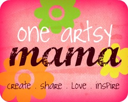
As you play around with design, you’ll come up with some things you like, and some you don’t. This is the very first button I ever tried to design. It’s a far cry from what I ended up with, but I did find that I liked the font, and I liked that little flower.

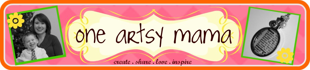
A few edits later, and you have the current version:
Keep experimenting until you find the design that makes you say YES!
Something unique, something YOU.
It’s totally worth investing your time because it’s the first impression that every person who visits your blog will have: that means readers, potential followers, potential sponsors and affiliates too.
Again, I’m no expert, it’s just this artsy mama’s thoughts on a crucial element of blogging.
What are YOUR thoughts?
See you tomorrow for some basic posting tips!


Hahah I love that I can tell you used My Memories for the button. I’m still absolutely in love with the program and use it at least once a day! Thanks for the giveaway again!
I’m so excited for this series. And, I’m proud to say, that my blog has been blessed with graphics from One Art Mama!
These are great tips and reminders….I think I’ve got a little blog cleaning to do 🙂
I agree it does take time to find the design that works. I must have sat around thinking about it for weeks before I decided on my current one, but still not sure if it’s the last. Looking forward to the rest of the series!
Great advice! I’m looking forward to the rest of this series to see what ideas I can glean. 🙂
Thanks so much for doing this! I’m really excited to read on! 🙂
I totally agree about the clutter… if there is a blog that has so much going on the sidebars that it detracts from the main body and content… it’s hard for me to read.
I try and keep my sidebar clutter to a minimum. I put all of my features on a separate page, and now that I have the social media buttons, I don’t have to have all of the other stuff that used to be there:)
Great post!
Great post! If you ever have time, would you mind checking out my blog and telling me if there are things that you would personally change? I would love someone else’s opinion. Thanks!!!
I’m really looking forward to this series. I gobble up anything and everything anyone has to say about building your blog! I tried and keep this in mind as much as possible when doing my own blog design, but I’m not a simple kind of girl, and I want to stay true to who I am. I haven`t had any negative feedback, so hope it’s pleasing for everyone.
One thing I’ve never seen covered and would love to hear your input, is on what is considered clutter in the sidebar. What should and shouldn’t be in the sidebar(s), and what could be. I know everyone’s idea is different, but I’d love a clear opinion on the matter.
Great tips, I really need a more unique for my blog. Yours is very cute BTW.
Great post! I hope I’m exhibiting these things 🙂
thanks for this post. your timing is impeccable. i just changed my header and background last night. am still trying to figure out if i like it or not. i really wanted to use the picture that i did for my header, so that sort of limited color choices, which are a lot more subdued than before. still unsure what i think of it. but after i read this, your comment about keeping your theme for your brand somewhat consistent resonsated with me. i sort of did an about face on my look and i’m questioning a bit. i don’t know. will be coming back and rereading this over the next few days while i contemplate! thanks so much…
I opened up my blog page so I could bounce back and forth between your post and mine. I went through suggestion by suggestion to see how I was measuring up. Thanks for the helpful tips. I have some things to think about and change now. 🙂
I also leave blogs that are all compartmentalized and boxy with ads in between- it’s just too much for me. I hope my blog is neat and tidy but still “me”
Great post and great series!!! I am never satisfied with my design…
Thanks so much for this post/series. I am a new blogger–learning as I go along. My blog name (& header) come from a little plaque that’s affixed to my house. I love the colors in it and want to work from that but I need to figure out how to make a button from it. I’m also striving to keep the blog neat & streamlined. It’s so tempting to put lots of “stuff” on the sidebar but it can be visually distracting so I’m trying to keep that neat. Anyway, I look forward to the rest of the series!
~Elena
http://acasarella.blogspot.com/
Blog design is my biggest problem. I’m using a template from my host which is very limited and difficult to work with. I’m thinking about moving my blog to a different host. Everything I try to do so hard. As creative as I am, it’s hard for me to say exactly what I want. I know exactly what I don’t want though.
Thanks so much for sharing your great tips at the Blog Tips Cafe linky party over at I Gotta Create! These are so helpful.
<3 Christina
http://igottacreate.blogspot.com/2011/12/fresh-new-year-blogging-tips.html
#3 is so important!!! If it’s hard to read, it kind of defeats the purpose. More great tips, Amy.
I have so much to learn, but your series is very encouraging and easy to understand. Thanks for the tips. I’m gearing up to do some tweaking!
Hello! I’m a new follower and I love your blog! I was wondering how you created the above designs? With what program and/or website, like PicMonkey, Photoshop…etc?
Thanks!
Heather
Just began redoing my entire blog and created a header that I love. Just stumbled upon your blog through pinterest and I really liked this post! Its great for beginners. Check out my blog…
http://www.leannaranieri.blogspot.com
Enjoy and thanks for a great post! I definitely will follow your blog!